Thursday, May 16, 2019

EXTRA CREDIT QUESTIONAIRE

1. Which assignment did you ENJOY working on the best? Why?
2. Which assignment did you ENJOY working on the least? Why?
 
3. How did you like using BLACKBOARD?
4. What is your opinion of the Discussion Groups in this course?
5. Did you participate in any of the extra credit projects in previous modules? If so, what was your opinion of them? (mandala, elgin marbles, culture, art critics)

6. If you had the opportunity to change this course:
What would you keep?
What would you remove?
What would you add?
7. Would you recommend this course to your peers?

8. Please list any other comments you would like to share.


1. The assignment I enjoyed the most was Project 4. I thought it was cool to basically create an exhibit of my own, for whatever artist or artists that I chose. This was also an amazing opportunity to discover an artist I know very little about

2. The assignments i enjoyed the least (really not at all) were doing the video reviews. This was because all of the questions were always the same, for every single set of videos. It became redundant and boring. I also did not like the most of the videos were an hour long.

3. I think blackboard is a convenient service. I think this class was a bit difficult to navigate and keep track of, while on blackboard though. Everything was in a different section and folder. It took a lot of searching and scrolling to be able to find anything. 

4. The discussion group was pointless to me because no one cared to respond to anyone else. And a lot of the times, the discussion questions were similar to our blog postings. It was very redundant. 

5. No, I did not do any prior extra credit.

6. I would change the class from an online course to in-room class exclusively. I think this class is much to in-depth to leave comprehension entirely up to the student.
I would remove the graphics from the modules because it was elongated the page and made scrolling down very annoying.

7. I would recommend this to my peers, only if there were an in-class alternative. 

8. Thank you, Professor Tabone, for everything you've offered to us and taught us. I appreciate this class and the information that it was presented to me. I definitely have a deeper appreciation not just for art itself, but also for the reason why the art came to be. I think without this class, I may not have considered that so deeply.


AED 200 Reflection

1. What were you expectations for this course and where they met?
2. Now that you've been through this course, What is art? How would you define it now compared to your intial posting?
3. Who was your favorite artist in your original posting and who is your favorite visual artist now? If there is a difference, why do you think so? If you have the same favorite artist, why do you think so?

4. Now that you've completed this course, how do you feel about taking an online course? Is your answer the same as it was in your first posting? How is it the same or different?


1.) I honestly had no idea what to expect for an art inquiry class. I did not know what art inquiry was. I am still a bit unclear on what exactly it is but I did enjoy the concepts and all of the videos and other media we were given during this course. 

2) After taking this course, I would define art as the creative expression of the human experience. I would have defined art as the expression of human emotion, at a point in time but I realize art is much more than that. It is more than just emotion. It is what we think, what we feel, what we do, want to do, and don't want to do. It really is the center of the human experience. 

3) My favorite artist was Takashi Murakami but now I would have to say It is George Condo. My answer definitely changed since my first posting after taking the time to dive into Condo's work. 

4) I still do not enjoy online classes. I think they are difficult to keep up with when you are already so enveloped in a full schedule of physical classes that all have their own homework schedules. 

Sunday, May 5, 2019

Module 13-14: Video Review


In the first video I definitely learned the importance of thematics and consistency. In particular, I learned about the lowbrow art movement. Lowbrow art was un underground art movement in the 60's, next to the punk rock movement and the emergence of psychedelics. Lowbrow was characterized by heavy use of various colors, and edgy, sometimes morbid imagery.
Artists such as Edgar Leeteg and Big Daddy Roth played a large part in this movement. They did this by using different mediums, Leeteg painted on velvet and Roth - tattoos.

In the second video, I very much enjoyed the art show. What I enjoyed most about it was the huge difference in art, whether painted, drafted, sculpted or created by some other medium. What we call modern art, seems to be a movement of statement art. Through the use of some of the most important elements such as color, and composition, and most importantly form. I'm learning that art, does not particularly have to be about something to represent many things. Modern art seems to be more rebellious and negligent of rules. More free in its execution and infinite in it's creation.

In total, I enjoyed both videos very much. I think that they both definitely helped in my understanding of how to properly conceptualize my project and focus on exhibiting a specific art style.

Sunday, April 28, 2019

Module 12 Video Review

The two videos I decided to watch were Isamu Noguchi and Andy Warhol.


In the first video about Isamu Noguchi, I learned about the importance of experimentation in art. 
Noguchi was a sculptor to be specific, and in his works he always pushed the limits of the elements with which we worked. For example, his golden sculpture in New York City seems to focus heavily on emphasis and perspective. It is a more complex work, unlike his Red cube sculpture which is a more minimal piece that focuses heavily on subtraction and position.
I can say this video definitely helped me understand more about what makes a sculpture successful.
It doesn't always matter what the sculpture is about, it can also be the craftsmanship of the sculpture and the process of how it came to be.

In the second video about Andy Warhol, I learned about his very clever use of color, shade, and value. I find that his pieces spoke for themselves through the identity Warhol created with them.
His portraits in particular, were absolutely beautiful and often brought  to life with brilliant colors.
I have been a Warhol fan for some time now so this video was great for me. I always love a chance to observe Warhols work because I feel like he is one of the most skillful and talented artist to ever use color. I definitely learn the harmony of colors and shapes and how they can be used in unordinary ways and still make a statement. 

Sunday, April 14, 2019

MODULE 10: Mask Making

Image result for spartan maskASPARTAN MASK, MADE PATINATED RESIN. 
I LIKE THE AGGRESSIVE SHAPE OF THE MASK.
 PARTICULARLY THE EYE AND FACE GUARDS
I ALSO LIKE THE RUGGED SURFACE OF THE MASK.

Image result for VEGA MASK
THE MASK WORN BY VEGA, A CHARACTER IN STREET FIGHTER
THE MINIMALISM OF THIS MASK IS WHAT MAKES THE AESTHETIC.
I ESPECIALLY ENJOY THE LARGE BLUE "J" EMBOSSED ON THE CHEEK.

Related image

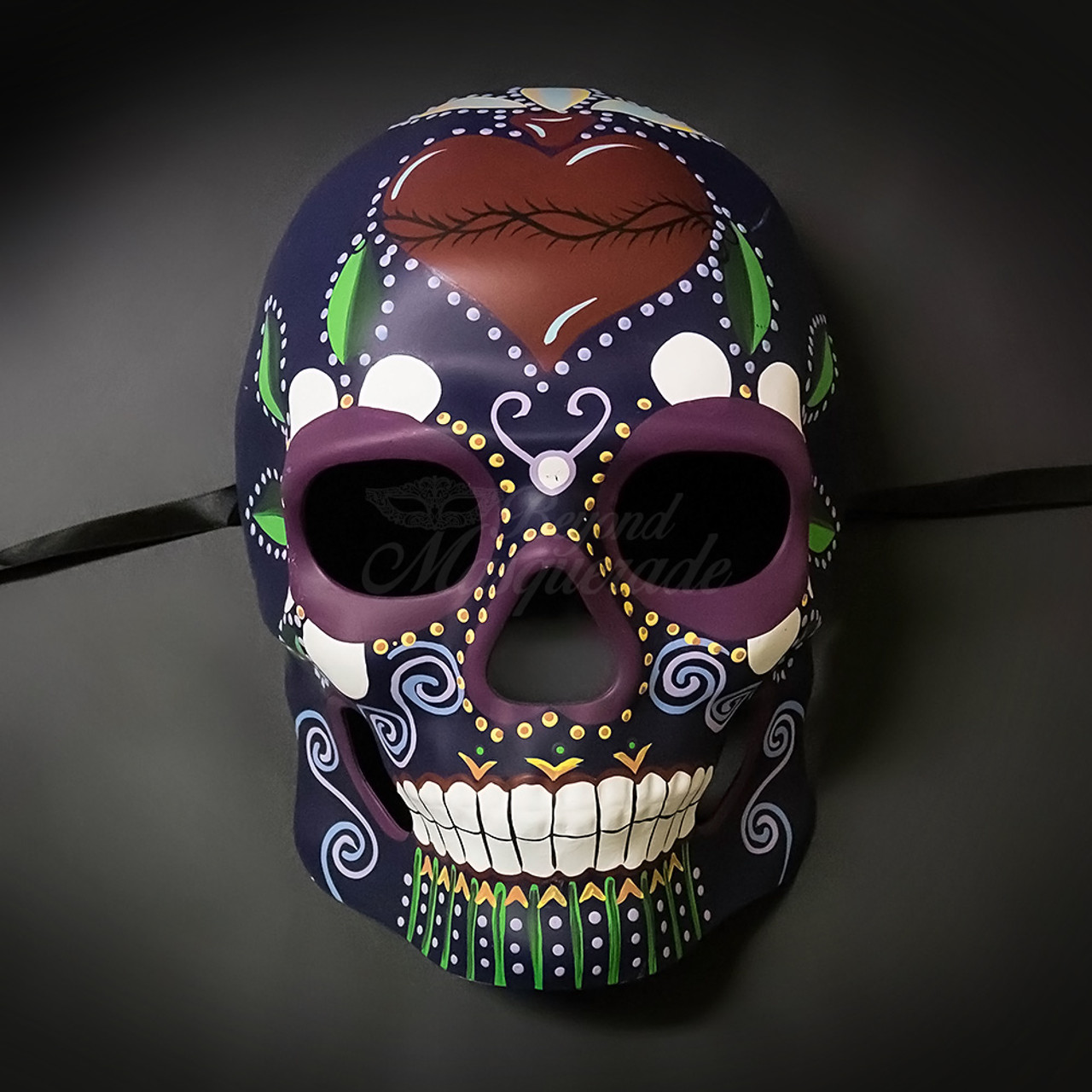
MASK WORN DURING THE MEXICAN HOLIDAY: DIA DE LOS MUERTOS OR DAY OF THE DEAD
I MOSTLY ENJOY THE INTRICACY OF THE HAND PAINTED DESIGNS.
I ALSO LOVE THE STRONG IMAGERY OF LIFE AND DEATH CREATED BY
THE PLANTS ROOTS AND PETALS ON A SKELETON.


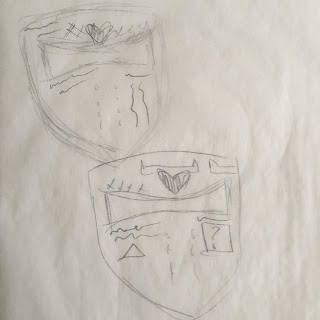
THESE ARE MY PRELIMINARY SKETCHES. I KNEW THE SHAPE AND THE MEDIUM THAT I WOULD EVENTUALLY END UP USING. BUT I NEEDED TO WORK OUT THE DETAILS OF THE MASK

THIS WAS MY MY FIRST ATTEMPT. I STARTED OFF THE SPIKES AND AND A HEART ON THE FOREHEAD. THAT LEAD TO ME EXPERIMENTING WITH HEARTS ON THE FACE AND CHIN PARTS OF THE MASK. I WANTED TO CREATE A SENSE OF BALANCE AND I NEEDED TO MAKE SURE I GET THE CORRECT SCALE BECAUSE I DIDNT WANT ONE ELEMENT TO BE MORE EMPHASIZED THAN ANOTHER, I WANTED EVERYTHING TO EVENTUALLY GRACEFULLY WORK TOGETHER.
 THIS WAS MY SECOND ATTEMPT. I BEGAN TO ENJOY WHAT I WAS GETTING AT. I NEEDED A WAY TO BRING OUT THE DIMENSIONS OF THE MAKS THAT I MOST ENJOY. I STARTED EXPERIMENTING WITH "TEXT". SCRIBBLES THAT I WOULD EVENTUALLY FILL IN WITH WORDS AND PHRASES AND SYMBOLS THAT COULD SPEAK FOR THE MASK. I ENJOYED THE IMBALANCE THAT THE SYMBOLS CREATED ON THE FACE AREA OF THE MASK. I WAS STARTING TO REALLY ENJOY THE HARMONY THAT I WAS CREATING IN THE MASK AND THE MOTION THAT MY EYES WERE TRAVELING WHEN I LOOKED AT IT - COUNTER CLOCKWISE.


THIS IS MY MASK.


I DECIDED TO GO WITH A HEART MOTIF ON THE FOREHEAD AND I DID USE WORDS AND SYMBOLS FOR THE MASK. THINGS THAT DEFINED THE OVERALL IDEA THAT I HAD FOR THE MASK WHILE I WAS SKETCHING IT - FREEDOM, PAIN, PEACEFUL PROTEST, EXHAUSTION, AND STRENGTH.

Module 10 video review

I chose to watch the video on Hinduism and the Video on Buddhism.
I chose both of these videos because of their short time duration.

1. Explain why you selected each of the TWO videos you choose from the selection listed above.
2. For each video list/discuss the key concepts you learned.
2. How do the videos relate to the readings in the text?
3. What is your opinion of the films? How do they add depth to understanding of the readings and art concepts?


Hinduism

I learned about the Hindu's use of the harmony and balance in their art. They use these two elements regardless of the medium of art, whether it's music, dance, illustrative arts, or ceremonial arts. The Hindu people also include these elements in more ways than one might think - using people, colors, sounds, and movements in cohesion to create an engaging experience in their part of the world. This includes anything from festive decorations to mass architecture. My opinion on this film as that the Hindu people, were very devoted to spiritualism. For this reason, they included strong esoteric imagery that dates far back into their origin. I believe these images and methods were maintained in full and left mostly unchanged, creating the very colorful and vibrant identity we, as a western civilization, imagine of Hinduism today. 

Buddhism

While watching the video on Buddhism, I noticed a special attention to pattern and proportion. This was used in a more traditional fashion. Using it as decor for buddhist apparel, embellishments on buddhist statues, and especially in buddhist architecture to tell complex stories of their history. What I enjoy most about this video was the sense of discipline that exists in the buddhist culture. Transcending their art, they have built their entire existence around discipline. So much so that everything they have created has a piece of history within it. They are a very devout people and I think if one could take such discipline - like the buddhist - and apply to art fully as many have in the past; the result will be and has been remarkably beautiful and almost incomprehensibly complex. 


Sunday, March 10, 2019

PEER REVIEW - REVIEW


I absolutely agreed with the elements and principles that both my peers have demonstrated. I think that more the most part, we all have a similar and considerably solid understanding of these artistic ideas. 

I did not have the same images as my peers did, on their museum visit blog. I enjoy that I didn't though. I like how subjective art can be  in how everyone can appreciate something entirely different about art but we are all still appreciating the same ideas. 

There was one photograph that I noticed. It escapes me which blog it was a part of but I definitely left a comment about it. I also enjoyed the perspective and proportions in the museum blog on blog two. 

I think leaving peer reviews is an interesting way to bring an online class together. I think its good for us all to be reminded that we are a class and we are learning the same concepts together. I also think this is a good way for us not only learn with one another but learn from one another.