Sunday, March 10, 2019

Video Review

In the first video about sculpting, I learned about the intricate process sculptors endure to even create one complete sculpture. I thought it was very thorough for the sculptor to create a clay model, then a negative silicone, then a plaster model, until finally a limestone model. I think This progression of mediums and step-by-step treatment indicates a lot of patience and dedication in the sculptor. I think this also represents the sophisticated focus and techniques the sculptor has applied  in order to produce such complex piece of art. I also learned just how dangerous collecting limestone from a deposit can be, using heavy machinery and forklifts to collect blocks of limestone

In the second video, I learned a similar concept. Only with glass instead. I did not realize that so many fine details went into creating ceramic products and glaze finishes. I would also say I even developed a new appreciation for glass. I always knew that glass was not a quick and simple thing to create. But things become even more complex when you look into the processes of other types of glass such as tempered glass. Tempered glass is heated to about 620 degrees farenheit and then rapidly air-cooled to give it an internal shock and weaken its' molecular structure.

Sunday, March 3, 2019

AED LOGO DESIGN


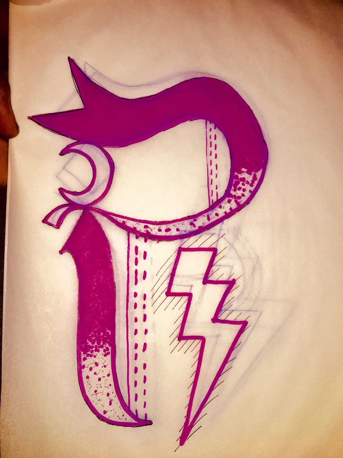
My logo is an abstract Letter R influenced by esotericism and an old english type face. 

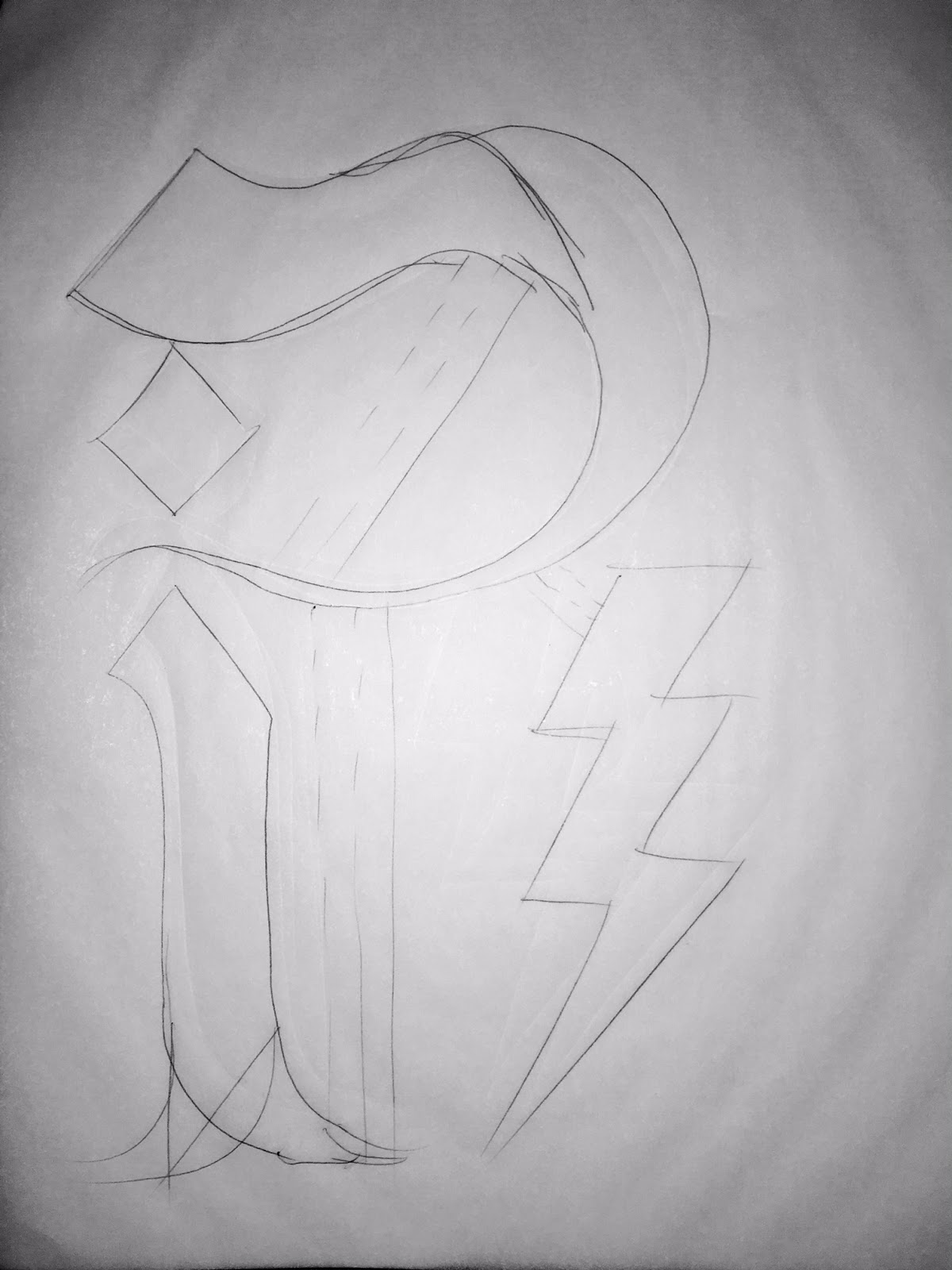
while working on this logo i wanted to make something that wasn't too busy as a logo, but also not too simple. I wanted to make something that i felt defined me, and included elements that I enjoy in art such as proportion, position, and gesture. I had a pretty solid idea what I wanted my final logo to look like so I began to create that figure in the very first sketch. I added the lightning bolt because it is a symbol that I always admired, even as a small child.  I then improved on line thickness and gesture of the flares when I moved on to the second draft. The third sketch is when I added the crescent moon form between the "hook" of the R because I wanted to continue to add symbols and shapes that have been a part of my aesthetic for for years. My fourth and final sketch is when i added dotted lines to taper the bold pink that I decided to use for my R. I then outlined the R with a fine tip black art pen. Even still this wasn't enough dimension for me so I added the geometric wires poking from the lightning bolt at a 90 degree angle to counter act the landscape format of the logo itself. 

The most important discovery I made during this process was the importance of tracing paper. My use of tracing paper helped me more accurately improve each draft without straying far from my original idea. 

AED PROJECT 2


 Which artworks make an impact or impression on me? Why?

These two artworks made the biggest impression on me because of their super exaggerated values. I love the strong light source from behind the clouds in the piece on the right. I also love the hazy sky and the eerie lantern light in the piece on the left. I was also so surprised to see just how strong of a contrast can still be created even when doing relief works such as the one on the left, as it was engraved into wood. 


Which artworks do I feel a connection with? Why?

     I felt very much connected to these pieces. being an artist myself, I love to create pieces with a strong color pop, strong gesturing geometry over a background with a muted tone. These two pieces were exactly that. I especially loved the light-weighted lines in the piece on the left and the camo-esque layout of the trees. I also love the balance between organic shapes and hard geometry in both pieces.  


  Which artworks would I like to know more about? Why?   

These pieces were the most enigmatic pieces to me. The three-dimensional sculpture was odd to me because it was apart of a series of sculptures. Each with no solid start or end point. The flow of each form was unpredictable and each form had no obvious common thread connecting it beside color and artist. The drawing of the hooded sheep was mysterious to me because it was between two other installations from the same artist that included both sheep, and dogs and even one shepherd. I had no idea what this hooded sheep could have meant or why it was between the other installations but the loose connection i was able to form definitely helped this piece standout.  


Sunday, February 24, 2019


10 STEP VALUE SCALE
- WHILE CREATING THIS SCALE, I FOUND IT MOST DIFFICULT TO MOST EFFICIENTLY TAPER THE VALUES FROM TRUE WHITE TO THE CLOSEST TRUE BLACK I COULD CREATE. IN ORDER TO ASSIST ME, I FIRST COLORED IN THE FIRST 3 BOXES AFTER WHITE. THEN AFTER FILLING IN MY BLACK TILE, I COLORED IN THE LAST 3 BOXES ABOVE IT. THIS LEFT ME WITH JUST 2 TILES, ONE JUST SLIGHTLY DARKER THAN THE OTHER. AFTER COLORING IN ALL MY TILES, I THEN REINFORCED THEIR VALUES BY SMUDGING MY PENCIL MARKINGS TO BLEND MY TILES INTO ONE ANOTHER. 

CMY/RGB COLOR WHEEL
- THIS WAS A FUN EXERCISE. I LOVE WORKING WITH COLORS, ESPCIALLY WITH PAINTS THAT I CAN MIX SO I WAS VERY EAGER TO MIX MY COLORS TOGETHER JUST LIKE THE PERSON IN THE VIDEO, I LOVE THE FINAL PRODUCT BECAUSE IT CLEARLY EXHIBITS THE SAME IDEA AS THE VALUE SCALE. THE NOTION OF A GRADIENT, A FAMILY OF COLORS THAT SEAMLESSLY FLOW ONE INTO THE NEXT. 


Which media did you enjoy working with the best and why?
- I ENJOYED WORKING WITH THE PAINT MOSTLY. BECAUSE I ENJOY THE HUES OF THE ACRYLICS AS OPPOSED TO THE SHADES OF A PENCIL. I ALSO LOVE THE EXPERIMENTATION OF COLOR MIXING AND COLOR CREATION.
3. What was the most important discovery in the creation of these studies?
- THE MOST IMPORTANT DISCOVERY HERE, FOR ME WOULD HAVE TO BE THAT ONE CAN CREATE RED GREEN AND BLUE FROM CYAN, MAGENTA, AND YELLOW. TO A GRAPHIC DESIGNER SUCH AS MYSELF, THIS IS A REMARKABLE THING TO LEARN ABOUT. IN GRAPHIC DESIGN, WE DESIGN IN RGB BUT WE NORMALLY MAKE PRINTS IN CMYK. I WAS ALWAYS UNDER THE IMPRESSION THAT THESE WERE TWO ENTIRELY SEPARATE FAMILIES OF COLOR. SO TO REALIZE THAT ONE LIVES WITHIN THE OTHER WAS AMAZING TO ME.
4. What is the most important information you learned from watching the videos for this project? What is your opinion of the videos?
- THE MOST IMPORTANT THING I LEARNED WAS THAT CYAN, MAGENTA, AND YELLOW ARE THE REAL PRIMARIES AS OPPOSED TO THE SCIENTIFIC BELIEF THAT BECAUSE WE HAVE RGB CONES IN OUR EYES, THOSE ARE THE PRIMARY COLORS. 

Monday, February 18, 2019

Color Theory and Emotional Effects

1. Describe Color and it's effects on emotions. Use the appropriate vocabulary of color in your posting.

 - Color is the visual representation of light particles being received by our eye. Color is created by the various oscillating waves of light, each with its' own respective hue. Our ROYGBIV/UV spectrum are the wavelengths perceptible to human beings but do not make up all of the wavelengths that exist.  

2. What is a theoretical aspect of color that most intrigues/fascinates you? Why?

- The most amazing aspect of color to me is the fact that our eyes do not see color, our brain creates color as an interpretation of the information it is provided. I find this remarkable because I appreciate the power of our brains. It is the most complex and efficient computing machine in the world. The way our brain processes information and amalgamates it into what we know as that we understand as our five sense - is truly amazing.

3. In the Color videos, what made the biggest impact on you in regards to color and it's effects on emotions?

- What made the biggest impact on me was, the experiment with the Himba Tribe in "The Science of Color Perception." I was so shocked when they revealed that one of the green squares was a different shade of green. More over, I was even more taken back when the people of the Himba could not distinguish the teal square from the green squares. This reveals a very interesting connection between geology and adaptation and just how much of who and what we are is determined by our nature. 

Project 1 Reflection Journal

PROJECT 1     In taking pictures for the 14 elements and principles of art, I found myself looking at objects and scenes far more subjectively. Suddenly, taking a picture was not as simple as pressing a button. I needed to make sure each image I took was accompanied by a feeling. I entirely believe that aesthetic pleasures create physical pleasures within us. I did not understand why but I do now. From my artistic point of view, I believe we feel these pleasure when any number of the elements and principles have been successfully accounted for.
     It is commonly mentioned that the human eye is attracted to perfect ratios. There is no doubt in my mind that these ratios go beyond physical scale and also include each of the 14 elements and principles. I think this is why we enjoy good art when we see it. Our mind and our senses have picked up on this perfect ratio - whatever it may be - and we feel pleasure, enamored by its' beauty.